
Teledyne FLIR: The World's Sixth Sense Return Merchandise Authorization (RMA) Process & Experience
Role
UX/UI Designer
Researcher
Sector
B2C, Web/Mobile
Stakeholder Alignment
Tools
Miro, Photoshop
Figma, PowerPoint
Survey Monkey
Team
UX/UI Designer, 2 Developers
Product Owner, Architect
Scrum Master, QA
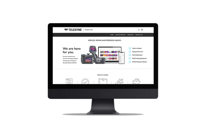
Different Users, Different Needs
Teledyne FLIR specializes in thermal imaging and sensing solutions, with infrared cameras, modules and imaging systems for security, industrial inspection, military and more. Customers can buy direct, through distributors or online.
With an account, customers can fill out a Return Merchandise Authorization (RMA) form through a link in the Customer Hub. This is the process through which customers and distributors request service or repair for their products. Teledyne FLIR staff also utilize this portal to lookup information about the requests.
As the UX Designer, I was responsible for improving the usability of the RMA submission process thereby reducing support calls, increasing repeat customers, and building long-term trust with the brand.
Problem
Customers found the RMA form difficult to navigate, citing unclear instructions, repetitive data entry, and no visibility into their request status. Many struggled to complete the process, resulting in incomplete submissions and a surge in support inquiries. On the internal side, staff faced high support volumes, negative user feedback, and cumbersome workarounds to manage requests. Partners and resellers reported encountering outdated information and incomplete processes that disrupted their workflows. These issues collectively raised concerns among FLIR leadership about delayed processing times, strained support resources, and an overall decline in customer satisfaction and brand perception.
Objective
Improve the RMA Process for all users: Customers, Staff, and Partners/Resellers.
Process
Next, I examined Oracle surveys from the last three months, watched recorded user interactions using Hotjar, surveyed partners and interviewed staff to gain a comprehensive understanding of each user's key goals. I used affinity mapping and theming to identify overlapping objectives and requirements for the RMA process. Here are the research methods I utilized for each user:
I started my research with time constraints, so I decided to do a direct competitive analysis instead of a traditional competitive analysis. I conducted a deep dive on Samsung, a company that offers a similar return merchandise process for their customers. I compiled findings into a presentation detailing Samsung's user experience, interface design, usability and content strategy. Here is a sample of my notes:


By averaging the ticket ratings of customers, analyzing survey results from partners and distributors, and receiving ratings and feedback from staff, I was able to measure the current state of the process/form.
Full Thematic Analysis
Using Miro, I categorized the qualitative data into themes, including Unclear/Confusing, Can't Find, Communication, Bugs, etc., and calculated the quantitative data to obtain average ratings in the areas of Accuracy, Commitment, Professionalism, and Time.

Thematic Analysis Example
End User/Customer Quotes
Can't find phone number or email address for support
No email address to reach someone
Can't find an email ID for support
Can't find support assistance
How do I contact someone for information?
Nowhere can I find a contact with an email address
Can't find email address or contact details
I don't see
your contact
No place for an email contact on support site
Why do you hide your phone number?
Can't find a contact link to
ask a technical question
I need to ask someone about
a product?
-
Users are frustrated by not being able to find support
-
Users want to contact customer support for various reasons
-
Site needs redesign so customer support is easier to find
-
Site and/or processes need redesign so users don't need to contact customer support
I categorized the findings by user type and created behavioral personas.
I chose behavioral personas because the focus was on improving an existing system's performance and behavioral personas focus on what users do, and want to do (e.g., goals, barriers and/or tendencies).

"I filled out the initial form online, got an email having to click to a new form (old link needs to be fixed then), which I clicked, had to fill out a new account,
got to verify the account with another email in a second browser, had to click back to the first browser, refresh, type in the same information from the first initial form, submit, got another email to verify email, then got another email stating it was being reviewed with a reference number link that didn't work or a link to update my request which didn't even list the initial request information. No updates, no calls, then four hours later got a survey to ask how my experience was. And all I need is my Flir recalibrated."
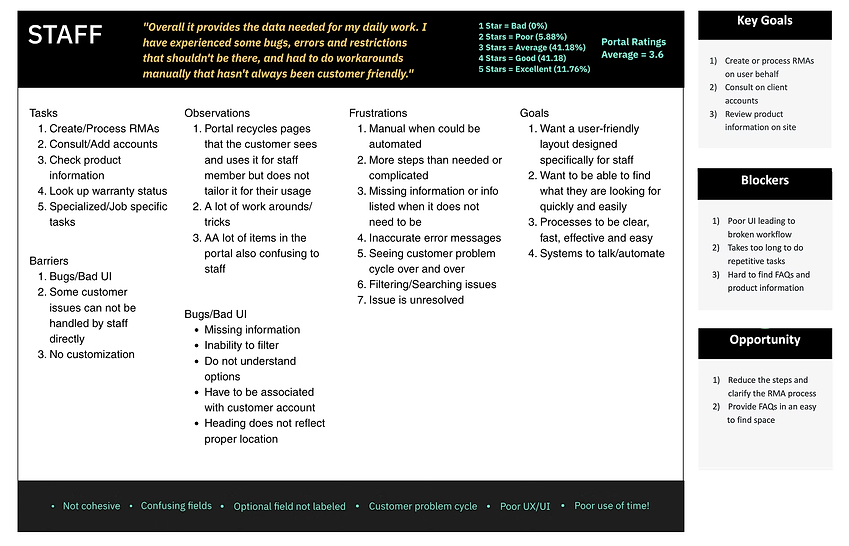
When a company has different emails, for different team m embers trying to see previous RMAs - there is only history under each email, but not under a company umbrella.. Having customers put in their tax ID number. We do not remove taxes based on the tax number and actually need a tax exemption certificate attached to
an SAP customer account. The tax ID field confuses customers. The "reference" field always ask what to put there. When customers select to provide their own freight carrier, there's a field that pops up for "tracking number." This always always always confuses customers because they 99.99% of the time do not have a tracking number yet. They call and ask why is it requiring a tracking number if they haven't shipped their camera yet, and we have to explain that it's an optional field."

It seems almost never updated, and while it is really great "sales brochure" approach - getting any hard information is non-existent access. I was/am disappointed that my old user name and password didn't apply to the lists or
user sites. Even more disappointed th old list no longer exists! Seems like it
wouldn't have taken an act of congress for the system to send out automated
emails to all registered users that things were going away.
The user group with the lowest score was the end user. They had the most difficulty, taking the longest to complete the flow. As a result, they often abandoned the process, leaving a negative review. The number of steps, lack of clarity in the process, and lack of accessible support left the user with few options.
It was determined that the first phase of the redesign would focus specifically on the customer-facing experience, beginning with the RMA form and submission process. Customers are the primary users initiating repair and service requests, and their ability to easily complete the form directly impacts both satisfaction and internal efficiency. By improving the customer journey first - clarifying steps, reducing friction, and minimizing errors - the redesign could yield the fastest and most visible results, such as fewer support calls and faster processing times. Once a smoother customer submission process was established, the second iteration would address the needs of staff and partners/resellers, optimizing their internal workflows and data management within the same system.
From the research, I identified clear objectives for improvement:
-
Simplify and streamline the form submission flow.
-
Increase clarity with contextual help and progress indicators.
-
Reduce redundant inputs for logged-in users.
-
Provide transparency and reassurance through confirmation and tracking.
With the focus shifting directly to the customer, it was time to do a complete evaluation of the current RMA form.
Outdated & Confusing Design
The original design of the RMA Form had an confusing, outdated format that often resulted in users abandoning task and/or needing help from FLIR Customer Service Representatives in order to complete the process.
The form does not reflect standard form design. It looks technical and does not appear user-friendly.

This copy is confusing and covers information that can be shown later in the process. User may not understand what is meant by "book a repair against your customer record" as this is not typical terminology.

Button is in an unusual location. The main call to action should be the focus. Lack of color camouflages it.
This bar is confusing. It appears to be the header for when a request is saved to show the user relevant information. Having it appear before the user has made a request appears like the form is malfunctioning.


Some product images appear twice like this camera and the Thermavision CM
It prompts user to select a product but does not show all of the available products.
The call to actions are "Register a New Product" and "Continue without registering a product" but does not inform the user if registration is required or the benefit of registering.

The previous screen also said this "Select a Product"
Says can add a description instead of a serial number or part number. Description of what? And where to add it?
Does not offer any help to the user where they can locate the serial number or the part number.

This notification goes back to mentioning registration. It is unclear if the user needs to register or what exactly to do next.

This icon is actually a clickable link to a form where you can submit a question to a Customer Service Representative. The icon does not look clickable and does not let the user know where it leads.
This only has two types of repairs with set prices regardless of issue. And Expedited does not tell how long comparison.
Not sure what is meant by Additional Items. Does not look like an attachment but just more description?
Both buttons are main calls to action with no priority and "Ok" does not inform the user of what to expect upon click.

This changed from a clickable icon to showing full contact info for support.
Some user information is remembered and auto fills while other information that should be stored has to be manually entered.
These "form fields" are unusual in their design. They don't separate the information or guide the user which could lead to missed information.
If this information is already stored and/or the same then does checking this overwrite what is currently in your profile?

This call to action does not explain what type of information to add.
No information is given to users about these two options. It is hard to make a decision if you do not understand the difference and/or advantage.
Does not offer any examples of what type of files the user might want to attach (Pics? Receipt?)
User Journey Map
To better understand the end-to-end experience, I created a Customer User Journey mapping how a customer interacts with the RMA process - from realizing they need to return a product to receiving confirmation of their submission to the ability to track their return. The user journey map identified key stages: discovering the RMA form in the Customer Hub, filling out product and issue details, submitting the request, shipping in their product, receiving repair estimate and awaiting service updates. By visualizing each step alongside the customer’s thoughts, emotions, and pain points, I was able to pinpoint critical moments of friction such as confusion around required information and uncertainty after submission. This journey map became a guiding tool for design decisions, ensuring every improvement addressed a specific user need and contributed to a more seamless, reassuring experience.

User Flow
Based on the insights from the customer journey, I created a detailed User Flow to visualize each step a customer takes from accessing the RMA form to completing their submission. This helped identify redundancies, clarify decision points, and ensure a logical, guided progression through the process.

Sketches
After mapping the user flow, I began creating sketches to explore how the RMA form could deliver a smoother, more intuitive customer experience. Starting with low-fidelity sketches allowed me to quickly iterate on layout ideas and information hierarchy without being distracted by visual details.


Sample Sketches


New & Improved Design
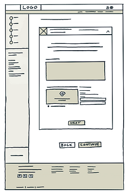
For medium-level fidelity wireframes, I focused on breaking the confusing form into a clear, guided step-by-step process. Each screen emphasized simplicity with prominent field labels, contextual help for complex inputs like serial numbers, and a visible progress bar to build confidence as users moved through each step.




Key Features:
-
Simplified multi-step form layout
-
Inline help and smart field validation
-
Confirmation screen with next-step instructions
-
Email confirmation and repair tracking link
The redesign balances usability and efficiency, guiding users through a complex process while maintaining FLIR’s professional tone and technical precision.
In order to develop a more effective design, I focused on finding overlapping patterns to help determine the most impactful changes to make. Customer feedback was analyzed and turned into design opportunities.

I simplified the UI to make it responsive for mobile. By adding the FAQ section to the RMA page, users no longer had to navigate to other pages. Additionally, I included a search bar at the bottom in case they still couldn't find the answers they needed. The path to create a new RMA, edit an existing one or check the status of an active request is easy to find with prominent CTA buttons.

My improvements focused on reducing the number of steps, providing an indicator of the user's progress, and creating a simpler UI with copy and hierarchy to guide them. It is important to remember that if the user is returning something, they may not be in a positive frame of mind. Therefore, the copy should be empathetic.

Added a header that clearly states the functionality of the page
This copy shows the company cares about its customers (empathetic)
Clear CTAs guide users to the correct form for their task
Adding a search allows the user to filter and find the specific information needed
List the different tasks or services that can be accomplished on page
This changed from a clickable icon to showing full contact info for support
Adding a FAQ section allows Flir to answer the users questions up front so they won't have to seek support
Additional Screens
New & Improved Design

The intro page introduces the Repair Request form, outlining its purpose and available options.
Users can request maintenance, calibration, or repair services.
The process is guided step-by-step, with the flexibility to save progress and return later.
Next Steps and Iterations
Before the first release, I transitioned out of the project to accept a higher-level UX position at another company. As a result, I was not directly involved in finalizing the design, testing, or releasing future iterations. However, my research, wireframes, and proposed user flows served as the foundation for the next phase of the project, guiding the team’s continued work on improving the RMA experience.
Next Steps:
-
Integrate status tracking within the customer hub dashboard.
-
Conduct usability testing on RMA Form and analyze results.
-
Finalize RMA Form based on findings from testing utilizing Flir's design system.
-
Design RMA Admin experience for Partners/Resellers.
-
Explore bulk RMA upload functionality for Partners/Resellers.
-
Design RMA Admin experience for Staff.
-
Validate changes with various user groups including reviewing tickets and conducting customer support interviews.
-
Continue monitoring metrics to inform iterative improvements.
-
Identify long term goals that will help their brand align to their user needs.
Success
Metrics
(Pre-implementation)
Hotjar + ticket analysis
Identified major RMA pain points
Simplified form flow
High-fidelity redesign created
Full documentation for next designer
Research
Insights
Structure
Redesign
Handoff
-
Surface critical usability issues through Hotjar data, ticket analysis, and competitor review
-
Clarified customer needs with personas, thematic analysis, and journey mapping
-
Simplified the RMA workflow with redesigned steps and improved form logic
-
Created validated user flows and wireframes that guided the high-fidelity redesign
-
Produced a complete design package and next-step recommendations for the incoming designer

