
Success
Metrics
Logility: Assemble Design System (ADS)
Role
Product Designer
Researcher
Sector
B2B Saas, Gen AI
Stakeholder Alignment
Tools
Mural, Photoshop
Figma, Maze
Google Forms
Team
UX/UI Designer, 2 Developers
Product Owner, Scrum Master

Project Overview
As the Design System Lead, I was responsible for the creation, documentation, and governance of a scalable and accessible design system used across multiple product teams. The goal of the Assemble Design System (ADS), the first in-house design system for Logility's supply chain software suite, was to make web application development fast and efficient while maintaining a high level of consistency, quality, and accessibility. The design system consisted of working code, design tokens, Figma UI kit and guidelines to craft positive user experiences and build modern supply chain digital products.
Double-Diamond Method
The process of building a design system can be mapped effectively to the Double Diamond model. In the early stages, I focused on identifying the core problems by researching existing practices and conducting one-on-one interviews with multiple product teams. With a solid understanding of the challenges and needs, I developed a plan that outlined the structure of the ADS and the timeline for delivering each component tier. As the components were rolled out incrementally, the team encouraged continuous feedback to support timely iterations and ongoing improvements to the system.

Discover & Define
In the Discovery stage, my goal was to identify the specific challenges users faced with the existing system, along with their needs and pain points. To do this, I interviewed members of three product teams supporting various supply chain products, gathering insights from both designers and front-end developers.

It’s hard to hand off designs to developers when everyone is using different styles or patterns.
The UI looks outdated in some areas and modern in others, making our apps feel disjointed.
We spend too much time rebuilding the same components because there’s no single source of truth.
Every product team seems to be using a different version of a button or form; nothing feels consistent.
Users get confused because similar elements often behave differently across our many applications.
After I spoke with key stakeholders to learn about their challenges and expectations, I carried out a full UI inventory and audit to map existing components and their usage patterns. I also conducted an accessibility review to assess compliance and usability, and explored well-established external systems for inspiration and benchmarking. The data gathered was organized and analyzed in various ways, including these examples:
The Rose, Bud, Thorn activity helped to identify the following things about the current design system: What is going really well? Where are opportunities? What is really painful?


The results showed that there was a high level of design thinking, energy, and focus; that clarity on user stories and task prioritization was needed; and that the current design system was not being used and was based on little to no stakeholder feedback.
The provisional personas helped to identify: Who uses the design system? What do they care about? What are their pains and goals?


Identified Challenges
By reviewing existing brand guidelines, analyzing current design files, and interviewing key stakeholders, I gained a deeper understanding of the challenges the teams were experiencing:
1. There was significant inconsistency across applications, with
varying styles, color palettes, and component behaviors that
made the user experience feel fragmented
2. Many interfaces appeared outdated or visually misaligned,
making the products harder to navigate or understand for both
users and internal teams
3. Designers and developers frequently recreate components from
scratch due to the absence of a unified source of truth, resulting
in duplicated work and inefficiencies
4. Inconsistent interaction patterns and visual treatments across
products confused users and increased the cognitive load when
switching between applications
5. Collaboration between product teams was impacted, as
misaligned UI patterns and unclear component standards led to
friction during handoffs and slowed down delivery
Problems turn into opportunities when challenges are reframed as "How might we" questions:
?
How might we
create and organize the design system so components are easy to search, navigate, and adopt?
?
How might we
establish clear guidelines for component states, behaviors, and interactions to align design and development?
?
How might we
create a single, unified library so designers aren’t confused by multiple overlapping component sets?
?
How might we
ensure components are reusable and prevent designers from recreating them in local files?
?
How might we
expand the brand guidelines to include clear product design standards for digital experiences?
Goals, KPIs & Alignment
The findings from the research and analysis guided the development of clear strategic goals for the design system, measurable success metrics, and processes to ensure continuous stakeholder alignment.

Develop & Deliver
The Assemble Design System has three packages that need to be coordinated to maintain consistency between design and actual implementation. I was responsible for creating and maintaining the Figma UI Kit and documentation for designers in Storybook:

-
Figma UI Kit: A collection of Assemble components that allow designers to easily design user interfaces.
-
npm Package: Collection of Assemble components code that easily allows developers to create user interfaces.
-
Storybook: Documentation platform for the Assemble Design System. Both designers and developers use it for showcasing components and as a playground.

The design deliverables were structured in three main categories.
The first focused on foundational elements — typography, color, grid, spacing, and icons. The second was the UI Kit, which expanded on these foundations with components, building blocks, page templates, and tokens. The third was the Documentation, covering design principles, implementation guidance, do’s and don’ts, accessibility requirements, and release notes to support consistent adoption.
Colors
Colors define a brands identity, draws in users, and convey its message. A good design system keeps things consistent while allowing flexibility. With dynamic color management, changing a primary color in the design system automatically updates all related UI elements.
Accessibility was a key consideration in the development of the color palette. I utilized contrast checkers to ensure that all text and interactive elements meet WCAG standards. Adjustments were made to ensure that users with color vision deficiencies can easily navigate and interact with our platform.


To support accessibility, personalization, and modern UI expectations, the design system includes both light and dark modes. Each mode is built from the same core color tokens, ensuring visual consistency while adapting contrast, elevation, and emphasis appropriately for different environments. Colors were carefully adjusted to maintain legibility, meet WCAG contrast requirements, and provide a comfortable viewing experience across a wide range of lighting conditions.


Typography
I chose Inter font for the design system because it is designed for excellent readability, it comes in a wide range of weights and styles, it is optimized for digital use and it features clear distinctions between commonly confused characters which results in better accessibility.Color tokens can be applied to typography such as text-color, text-color-secondary, or text-primary.
Grid and Spacing
I developed a grid system to provide a consistent framework across all pages and components, ensuring a cohesive look and feel. I wanted it to be flexible, allowing designers to easily adapt to various content types and layouts without compromising the design integrity. For Assemble, I focused on balance, alignment, and visual hierarchy. Having a grid and spacing system streamlines the design process, making it easier to create and maintain layouts. It also enhances usability for end-users by providing a clean, organized, and intuitive interface.


Sample Components
I created a comprehensive set of reusable UI components as part of the design system, including buttons, form inputs, dropdowns, modals, and alert banners. Each component was designed with accessibility, responsiveness, and consistency in mind, ensuring seamless use across multiple products. I worked closely with developers to align component behavior with code implementations, and documented everything in a shared Figma library. These components significantly reduced design-developer friction, improved UI consistency, and helped product teams speed up their workflows.

Documentation & Designer Guidelines
Clear, consistent documentation is the backbone of an effective design system. In Figma, I created structured guides that outline component usage, interaction states, accessibility standards, and visual guidelines. This ensures designers and developers share a single source of truth, reduces ambiguity, and speeds up decision-making. By documenting patterns directly within Figma, the team can quickly understand how components work, when to use them, and how to maintain consistency across the entire product ecosystem.


I wrote and created visuals for the designer guidelines in Storybook. The goal was to establish fundamental design principles and patterns to provide a common language, a consistent look, and a reliable user experience when designing applications within the Logility brand.
Design guidelines included:

Design Principles
Feedback, Contribution
and Support
Default Libraries
Contrast & Accessibility
Elevation
Hierarchy, Negative Space
and Spatial Relationships
Design Tokens
Additional Guidelines

Design Tokens
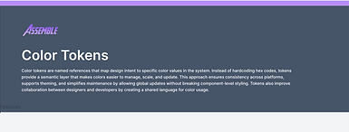
Design tokens are the foundational building blocks of a design system. They translate core visual decisions like color, typography, spacing, and component states into a unified, reusable source of truth. By defining these values in a structured, platform-agnostic format, tokens ensure consistency across products and allow teams to update styles at scale with minimal effort. As the Design System Lead, I established a comprehensive token library that aligned visual design, development, and accessibility requirements. This groundwork not only streamlined cross-functional collaboration but also created a scalable foundation for future components, themes, and system growth.

In building the design system, I defined the full token hierarchy—raw values, primitives, semantic, and component tokens—to create clarity, flexibility, and long-term scalability. Raw values served as the baseline numerical values (e.g., hex codes, spacing units) that powered the entire system. From there, I organized these into primitive tokens, grouping foundational decisions like base colors, typographic scales, and grid spacing. I then established semantic tokens to represent purposeful meanings such as “primary action,” “success,” or “surface background,” enabling the system to adapt to themes and accessibility requirements without changing the underlying structure. Finally, I created component-level tokens that mapped these semantics to individual UI elements, ensuring every component remained consistent and easy to maintain. This structured token architecture allowed teams to build confidently, iterate quickly, and scale the system with fewer breaking changes.

Documenting tokens in both Figma and Storybook ensures a unified source of truth for designers and developers. In Figma, tokens are surfaced through visual examples, usage guidelines, and component mappings that help designers apply them consistently. In Storybook, the same tokens are documented in code, showing how they translate into functional UI, with live previews and references for engineers. Together, these two spaces create a cohesive, end-to-end documentation ecosystem that supports scalability and cross-team alignment.


Governance Model
Customer feedback plays a pivotal role in the continuous improvement and evolution of the Assemble Design System. By actively engaging with our two primary personas, developers and designers, and incorporating their feedback, the ADS team can ensure that the system remains relevant, effective, and aligned with the needs of the user.
The success of the design system relies on effective adoption and integration into the organization's workflow. I therefore helped to develop a governance model that streamlines collaboration and engagement, to ensure ADS is seamlessly integrated into the design and development process. Using the governance model consumers can engage with the ADS team in the following ways:
-
Submitting feature requests: Propose new features or enhancements for ADS
-
Reporting bugs: Identify and report any issues or defects encountered while using ADS
-
Seeking clarification: Ask questions about specific aspects of ADS or its usage guidelines
-
Providing general feedback: Share thoughts, suggestions, and insights regarding ADS
-
Requesting consultation: Engage the ADS team for expert advice and guidance on specific design or development challenges
-
Contributing to ADS development: Actively participate in the evolution of ADS by proposing new components, patterns, or guidelines
The process for the design team would be reviewing notifications, meeting to discuss who needed to address the request and how urgent it was, and then either acting or creating a ticket to go in the backlog.


Below is an example of the flow where the user wants to ask a question. The user is directed to a form that captures who asked the question, an open field to type their question, the ability to add participants and the ability to attach a file or screenshot.
Usage and Feedback Survey
Several months after the release of the design system, I created a survey for designers, developers and product managers to obtain general feedback regarding the design system. The survey covered usage, familiarity, value, communication, integration, and training. Sample questions and results were as follows:


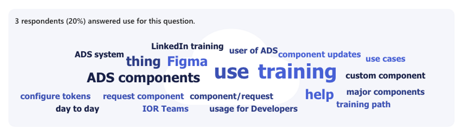
The data showed that the design system was being used and that most users are familiar with the governance model. One hundred percent of users indicated that ADS facilitates collaboration and communication, helps to maintain consistency, and supports the goals and objectives of the organization. Based on these survey results, the development and implementation of the Assemble Design System has positively impacted the team's overall productivity.
It should be noted that a third of users did indicate they would like more components added, while a fifth of users said that they feel like they could benefit from additional training. Results at a glance:

Before and After
The platform before the design system was very outdated and hard to use. The menu was a long, super dense list with no categories or visual aids to help the user navigate. The platform redesign using the design system resulted in categories that are color-coded, open to main menus and sub menu levels. The redesign added a user-friendly menu, notifications, an AI chat, saved tabs, a purposeful use of color and branding.

Responding to Challenges
One of the biggest challenges I faced was starting with no frame of reference for building a complete design system from scratch. To overcome this, I committed to a process of education, research, and immersion. I studied established design systems like Material Design and Polaris to understand best practices, explored documentation from leading teams, and engaged with community resources to learn what works and why. By combining this knowledge with iterative experimentation, I was able to define a clear structure, create reusable components, and establish standards that aligned with our product goals. Here are some other challenges I faced and my response:


Actual designs created by Logility designers using ADS

Overall, the feedback from the designers and developers was positive. Designers said the design system accelerated the design process, aided in consistency from project to project and made the hand off process more seamless. Developers also agreed that ADS streamlined the development process, minimized code mistakes and cause less design to development issues.
Success
Metrics
94%
100%
100%
100%
94%
Reported the system adds value
Improved design-to-dev workflow
Strong agreement on productivity gains
Find Storybook documentation useful
Team familiarity with the design system
-
94% of designers/developers reported being somewhat to very familiar with the design system after launch
-
100% agreed or strongly agreed that the design system is valuable to their work
-
100% agreed or strongly agreed that the system improved the design-to-code workflow
-
100% strongly agreed the design system positively impacted their productivity
-
80% reported being familiar with and finding Storybook documentation useful
