
Teledyne FLIR: The World's Sixth Sense SSO Experience
Role
UX/UI Designer
Researcher
Sector
B2C, Web/Mobile
Stakeholder Alignment
Tools
Miro, Photoshop
Figma, PowerPoint
Survey Monkey
Team
UX/UI Designer, 2 Developers
Product Owner, Architect
Scrum Master, QA

Clarity Is Key
Teledyne FLIR specializes in thermal imaging and sensing solutions, with infrared cameras, modules and imaging systems for security, industrial inspection, military and more. Customers can buy direct, through distributors or online.
The company had a poor user experience on Flir.com for account creation, so I implemented a single sign-on (SSO) system to streamline and secure the process. I also improved navigation and clarified language to ensure users could easily access their accounts.
These issues impacted the success rate for user signups, and created a lot of frustration from the start when working with new customers or clients. The goal was to ensure successful signups through clear steps and strong design.
Process
Customers were observed as they went through the account creation flow. I noted key points of friction and any tasks that could not be completed. Clarification was often needed for terms and legibility. I then created suggestions to address the key pain points with simple yet effective solutions.

Identify Pain Points

Guiding Users

A clearly defined user flow is essential when designing a single sign-on (SSO) experience because it ensures that users can easily navigate through authentication processes without confusion or friction. In this flow, users begin at a single entry point—“Sign In/Sign Up”—and are then guided down one of three intuitive pathways: signing up for a new account, signing in to an existing one, or recovering a forgotten password.
Each path is streamlined with clear steps, from entering an email and verifying an OTP for new users to resetting passwords securely for returning users. By mapping out these interactions visually, I can simplify decision-making and maintain consistency across all access points. Ultimately, an effective user flow not only enhances usability but also builds user trust by creating a seamless, predictable experience that ends with successful access to the user’s account.
Good Copy is Thoughtful

The former sign-on design was very confusing to users. Test users would click the profile icon and choose "sign up" only to be taken to the screen above. Seeing the heading "Sign in" when the user is trying to create an account can cause a user to feel like they reached that screen in error. Looking closely you can see a very small prompt telling users to enter their email address to create an account.

The new sign-on design gave the user a clear cut path to accomplish sign in or account creation. The primary call to action (Log in) is highlighted, the password text field has visual control, and users are given the benefits of account creation. The new design has a more modern look and feel, focuses on accessibility and addresses all of the pain points that were hindering users.
Make Things Easy
Sometimes the smallest changes can make a big impact. For the OTP email, I noticed users having trouble entering their code. By increasing the size of the code, giving it its own line, and adding a background the code becomes easy to copy and paste on mobile or quickly read off. It is important to make things simple for users to process, especially if multiple step are involved.

Former FLIR OTP email

New FLIR OTP email
Eliminate Road Blocks

This confirmation screen from the original design was very confusing for the test users. The message tells users that the account has been created but tells them they have to wait to log in. The user is then prompted to close the page which actually causes the user to leave the site entirely.

The redesign confirms and thanks the user for the account creation. The user is then given a clear directive of how to access the account they just created. The user knows the interaction has been successful and does not have to guess next steps. The user remains on the site which is ultimately where the company wants customers to be.
New Design
In the original design users were encountering two very separate flows: Sign in and Sign up (create an account). Both flows were confusing, taking the user to unnecessary screens that contained unclear directives.
The new flow combines the process so the user can easily choose the desired process. All of the new screens are user-friendly with easy to follow steps and a clean, updated interface.


Form Field Specs
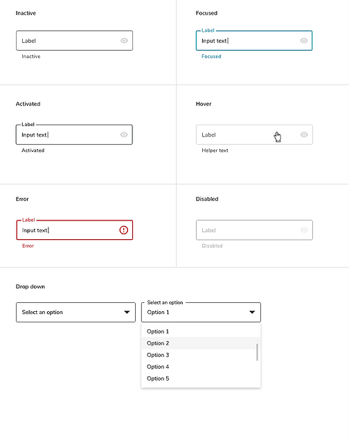
Before handing off the design, I created documentation around the form inputs and their intended interaction so engineers could work autonomously. This also helps any future designer picking up the work to have an understanding of the components used.
Overall, the changes implemented led to a better user experience. This is essential when working with new users/customers as they are building a perception of the brand and products based on their experience on the company website. By gaining a deeper understanding of FLIR’s user frustrations, I was able to create a solution that has improved the user experience and increased customer satisfaction.
.png)
Success
Metrics
30-50%
20-40%
Fewer failed signups
Faster account creation
Login-related support tickets reduced
Simplified steps
Improved first-touch experience
Lower Support
Clearer Flow
Better Onboarding
-
Approx. 30–50% reduction in failed signup attempts after SSO rollout
-
Estimated 20–40% faster account creation due to streamlined steps
-
Marked decrease in support tickets related to password resets or login issues
-
Higher user trust signals after adding clearer language and secure sign-on messaging
-
Smoother onboarding experience for new customers and distributors across regions

